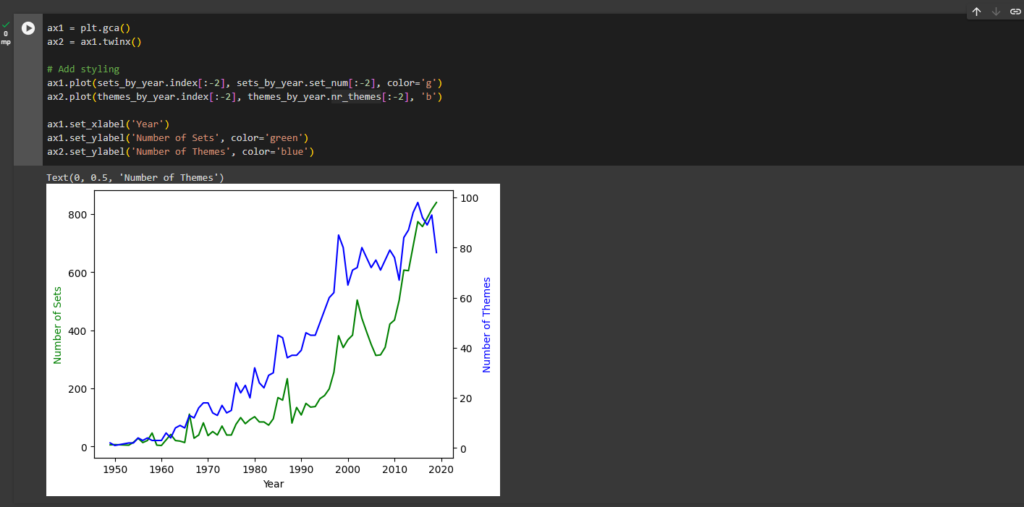
Analysing a Dataset of LEGO Pieces
Aggregate and Merge Data in Pandas
We are looking for some answers for many questions:
- What is the most enormous LEGO set ever created and how many parts did it have?
- In which year were the first LEGO sets released and how many sets did the company sell when it first launched?
- Which LEGO theme has the most sets? Is it Harry Potter, Ninjago, Friends or something else?
- When did the LEGO company really take-off based on its product offering? How many themes and sets did it release every year?
- Did LEGO sets grow in size and complexity over time? Do older LEGO sets tend to have more or fewer parts than newer sets?
In the exercise I will use Google Colab Notebook software. It is essentially just an online version of Jupyter.
Step #1 - Read the colors.csv file from the data folder.
We’ll use: Pandas.
import pandas as pd
Step #2 - Examine the Structure
We can see, how looks the ferst 5 rows in the head() section.
colors = pd.read_csv('data/colors.csv')
colors.head()
Step #3
We see that there are 5 columns, which include the name of the colour and its corresponding RGB value. How many different colours does the LEGO company produce? To find the number of unique colours, all we need to do is check if every entry in the name column is unique.
colors['name'].nunique()
There are 135 different colours.
Step #4
Find the number of transparent colours. There are two different ways:
colors.groupby('is_trans').count()
colors.is_trans.value_counts()
There are 28 transparent colours.
Step #5 - Exploring the sets.csv
The sets.csv contains a list of LEGO sets. It shows in which year the set was released and the number of parts in the set.
I will take the first steps in exploring this dataset. We can read the .csv and take a look at the columns.
The first step as always is reading the .csv file and looking what’s in it. We see that there’s some sort of id for each set (the set_num), the name of the set, the year in which it was released, the theme_id (the code for the theme name) and the number of parts.
So it looks like we have everything we here to answer our two questions.
sets = pd.read_csv('data/sets.csv')
sets.head()
sets.tail()
sets.shape
sets.isna()
Step #6
In which year were the first LEGO sets released and what were these sets called?
To find the year when the first LEGO sets were released we have to sort by the year column. The .sort_values() method will by default sort in ascending order.
sets.sort_values('year').head()
Step #7
How many different products did the LEGO company sell in their first year of operation?
Looks like LEGO started all the way back in 1949! The names for these sets are nothing to write home about, but let’s find out how many different products the company was selling in their first year since launch:
sets[sets['year'] == 1949]
Back in 1949, LEGO got started selling only 5 different sets! Here we are filtering our DataFrame on a condition. We are retrieving the rows where the year column has the value 1949: sets[‘year’] == 1949.
Step #8
What are the top 5 LEGO sets with the most number of parts?
Now let’s find the LEGO set with the largest number of parts. If we want to find the largest number of parts, then we have to set the ascending argument to False when we sort by the num_parts column.
sets.sort_values(by='num_parts', ascending=False).head()
The largest LEGO set ever produced has around 10,000 pieces.
Step #9 - Visualise the Number of Sets Published over Time
Now let’s take a look at how many sets the LEGO company has published year-on-year. This might tell us something about how LEGO’s product offering has changed over time.
First, let’s import Matplotlib to the 2nd row of code so we can visualise our findings up top:
import pandas as pd
import matplotlib.pyplot as plt
Step #10
sets_by_year = sets.groupby('year').count()
sets_by_year['set_num'].head()
sets_by_year = sets.groupby('year').count()
sets_by_year['set_num'].tail()
From this, we can see that LEGO published less than 10 different sets per year during its first few years of operation. But by 2019 the company had grown spectacularly, releasing 840 sets in that year alone!
Step #11 -Data visualisation with Matplotlib
We also notice that there is an entry for 2021. The .csv file is from late 2020, so it appears that it already includes some sets on a forward-looking basis. We’ll have to take this into account for our charts:
plt.plot(sets_by_year.index, sets_by_year.set_num)
Step #12 - Misleading chart (to improve!)
Because the .csv file is from late 2020, to plot the full calendar years, we will have to exclude some data from your chart. We have to use the slicing techniques to avoid plotting the last two years. The same syntax will work on Pandas DataFrames. If we don’t exclude the last two years we get a dramatic drop at the end of the chart.
This is quite misleading as it suggests LEGO is in big trouble! Given the dataset does not include a full calendar year for 2020, it’s best to exclude the last two rows to get a better picture:
plt.plot(sets_by_year.index[:-2], sets_by_year.set_num[:-2])
We also see that while the first 45 years or so, LEGO had some steady growth in its product offering, but it was really in the mid-1990s that the number of sets produced by the company increased dramatically!
We also see a brief decline in the early 2000s and a strong recovery around 2005 in the chart.
Step #13 - Aggregate Data with the Python .agg() Function
Let’s work out the number of different themes shipped by year. This means we have to count the number of unique ids per calendar year.
The .agg() method takes a dictionary as an argument. In this dictionary, we specify which operation we’d like to apply to each column. In our case, we just want to calculate the number of unique entries in the theme_id column by using our old friend, the .nunique() method.
Let’s give our column in themes_by_year a more appropriate name and let’s take a look at what we’ve got:
themes_by_year = sets.groupby('year').agg({'theme_id': pd.Series.nunique})
themes_by_year.rename(columns = {'theme_id' : 'nr_themes'}, inplace = True)
themes_by_year.head()
Step #14
themes_by_year.tail()
Here we can see that LEGO only had 2 themes during the first few years, but just like the number of sets the number of themes expanded manifold over the years. Let’s plot this on a chart again.
Step #15
Create a line plot of the number of themes released year-on-year. Only include the full calendar years in the dataset (1949 to 2019).
plt.plot(themes_by_year.index[:-2], themes_by_year.nr_themes[:-2])
Step #16 - Superimposing Line Charts with Separate Axes
Wouldn’t it be nice to have the number of themes and the number sets on the same chart? But what do we get if we just plot both of them the way we have before?
# This looks terrible
plt.plot(themes_by_year.index[:-2], themes_by_year.nr_themes[:-2])
plt.plot(sets_by_year.index[:-2], sets_by_year.set_num[:-2])
Step #17
Well, that’s not very informative! The problem is that the „number of themes” and the „number of sets” have very different scales. The theme number ranges between 0 and 90, while the number of sets ranges between 0 and 900. So what can we do?
Two Separate Axes
We need to be able to configure and plot our data on two separate axes on the same chart. This involves getting hold of an axis object from Matplotlib.
We then create another axis object: ax2. The key thing is that by using the .twinx() method allows ax1 and ax2 to share the same x-axis. When we plot our data on the axes objects we get this:
ax1 = plt.gca() # get the axis
ax2 = ax1.twinx() # create another axis that shares the same x-axis
ax1.plot(sets_by_year.index[:-2], sets_by_year.set_num[:-2])
ax2.plot(themes_by_year.index[:-2], themes_by_year.nr_themes[:-2])
Step #18
ax1 = plt.gca()
ax2 = ax1.twinx()
# Add styling
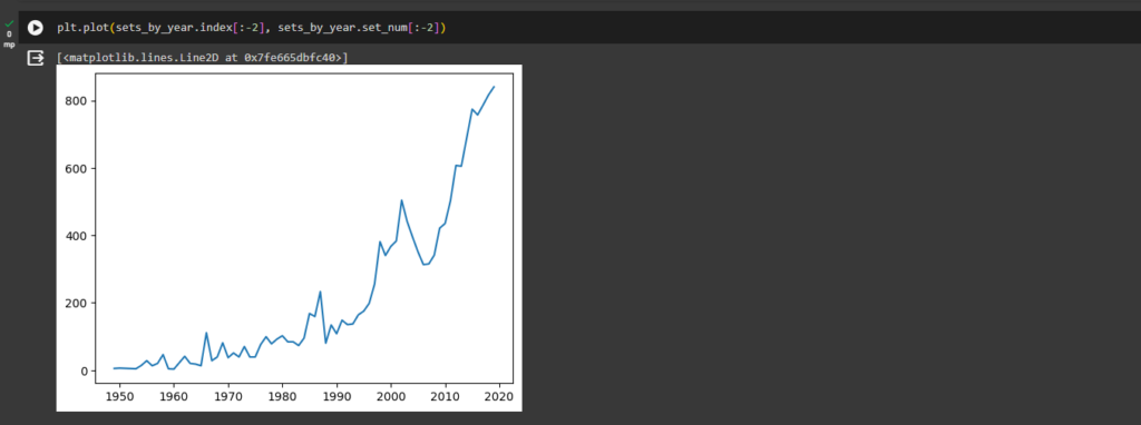
ax1.plot(sets_by_year.index[:-2], sets_by_year.set_num[:-2], color='g')
ax2.plot(themes_by_year.index[:-2], themes_by_year.nr_themes[:-2], 'b')
ax1.set_xlabel('Year')
ax1.set_ylabel('Number of Sets', color='green')
ax2.set_ylabel('Number of Themes', color='blue')
Step #19 - Complexity Over Time
Have LEGO sets become larger and more complex over time? Let’s work out the average number of parts per LEGO set. This is the perfect time to revise how to use the .agg() function.
Let’s create a Pandas Series called parts_per_set that has the year as the index and contains the average number of parts per LEGO set in that year.
We’re going to use the .groupby() and the .agg() function together to work this one out. However, this time we pass a dictionary to the .agg() function so that we will target the num_parts column with the mean() function. That way, we group our data by year and then we average the number of parts for that year.
parts_per_set = sets.groupby('year').agg({'num_parts': pd.Series.mean})
parts_per_set.head()
parts_per_set = sets.groupby('year').agg({'num_parts': pd.Series.mean})
parts_per_set.tail()
Step #20
To visualise our parts_per_set data, let’s create a scatter plot. A scatter plot simply uses dots to represent the values of each data point.
We just need to call the .scatter() instead of the .plot() method to create the chart. For the x-values, we’ll use the index of the parts_per_set Series (the years) and for the y-values, we’ll use the values of the series (the column name happens to be num_parts).
plt.scatter(parts_per_set.index[:-2], parts_per_set.num_parts[:-2])
Step #21
LEGO has licensed many hit franchises from Harry Potter to Marvel Super Heros to many others. But which theme has the largest number of individual sets? Is it one of LEGO’s own themes like Ninjago or Technic or is it a third party theme? Let’s analyse LEGO’s product lines in more detail!
Number of Sets per LEGO Theme
To count the number of sets per Theme we can use the .value_counts() method on our theme_id column. But there’s one problem:
set_theme_count = sets["theme_id"].value_counts()
set_theme_count[:5]
We have no idea what our themes are actually called! Ok, we can see that the theme with id 158 is the largest theme containing 753 individual sets, but what’s that theme called? This is not very helpful. We need to find the names of the themes based on the theme_id from the themes.csv file.
Step #22 - Working with a Relational Database
What is a database schema? A schema is just how the database is organised. Many relational databases, such as our LEGO data, is split into individual tables. We have separate tables for the colours, the sets and the thems. With a relational database, the tables are linked to each other through their keys.
Understand the theme.csv file
The themes.csv file has the actual theme names. How is this table linked to the others tables? Well, the sets .csv has theme_ids which match the id column in the themes.csv.
This means that the theme_id is the foreign key inside the sets.csv. Many different sets can be part of the same theme. But inside the themes.csv, each theme_id, which is just called id is unique. This uniqueness makes the id column the primary key inside the themes.csv. To see this in action, explore the themes.csv.
How is the themes.csv structured?
We have to search for the name ‘Star Wars’. How many ids correspond to the ‘Star Wars’ name in the themes.csv?
Use the ids we just found and look for the corresponding sets in the sets.csv (Need to look for matches in the theme_id column).
Exploring the themes.csv
themes = pd.read_csv('data/themes.csv')
themes.head()
Step #23
Each value in the id column is unique (this is the primary key for the themes table). The theme names are not unique. If we search for the name „Star Wars”, we see that 4 different ids correspond to that name.
themes[themes.name == 'Star Wars']
Step #24
sets[sets.theme_id == 18]
Step #25
Star Wars is a really long-running franchise. Theme number 18 was running from 2000 to 2002 and seems to be comprised of several of the show’s characters. What about, say theme 209?
sets[sets.theme_id == 209]
Here we see that all of the Star Wars Advent Calendars share the same theme_id. That makes sense.
Step #26 - How to Merge DataFrames and Create Bar Charts?
Wouldn’t it be nice if we could combine our data on theme names with the number sets per theme?
Let’s use the .merge() method to combine two separate DataFrames into one. The merge method works on columns with the same name in both DataFrames.
Currently, our theme_ids and our number of sets per theme live inside a Series called set_theme_count.
set_theme_count = sets["theme_id"].value_counts()
set_theme_count[:5]
Step #27 - Merging (i.e., Combining) DataFrames based on a Key
To make sure we have a column with the name id, I’ll convert this Pandas Series into a Pandas DataFrame.
The Pandas .merge() function
merged_df = pd.merge(set_theme_count, themes, on='id')
merged_df[:3]
The first 3 rows in our merged DataFrame look like this:
Star Wars is indeed the theme with the most LEGO sets. Let’s plot the top 10 themes on a chart.
Step #28 - Creating a Bar Chart
Matplotlib can create almost any chart imaginable with very few lines of code. Using .bar() we can provide our theme names and the number of sets. This is what we get:
plt.bar(merged_df.name[:10], merged_df.set_count[:10])
Step #29
plt.figure(figsize=(14,8))
plt.xticks(fontsize=14, rotation=45)
plt.yticks(fontsize=14)
plt.ylabel('Nr of Sets', fontsize=14)
plt.xlabel('Theme Name', fontsize=14)
plt.bar(merged_df.name[:10], merged_df.set_count[:10])
The ‘Gear’ category itself is huge and includes everything from bags to pencil cases apparently. Has LEGO strayed from its core business or is it successfully diversifying? That we can’t answer from our dataset.